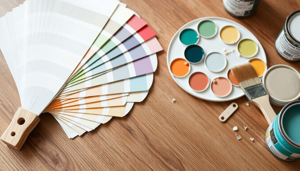
How to Choose a Paint Color: Step-by-Step Guide for 2025-2026
Choosing a paint color often feels like a lottery—too many swatches, too little confidence. But the truth is that a few structured techniques, like the 60-30-10 rule and a simple lighting check, can turn guesswork into a repeatable process.
Quick snapshot
- The 60-30-10 rule divides a room’s color into 60% dominant, 30% secondary, 10% accent (DAB Painting LLC).
- Interior designers describe the 60% portion as the dominant room color, often covering walls (Homes & Gardens).
- Color temperature (warm or cool) affects how a room feels (DAB Painting LLC).
- Whether gray will be completely out of style by 2026 or remain as a supporting neutral (no consensus from major paint brands).
- Which specific warm neutral (greige, beige, taupe) will dominate — depends on brand campaigns and regional preferences.
- 2020‑2023: Gray is the dominant neutral in interior design (trend data from multiple paint brands). (DAB Painting LLC)
- 2024‑2025: Shift toward warm neutrals (beige, greige) begins (DAB Painting LLC cites color‑temperature guidance).
- 2026 (predicted): Warm neutrals and earthy tones likely replace gray as top choices (industry consensus, no single source). (DAB Painting LLC)
- Use the 60-30-10 rule to balance any palette, regardless of trend (SixtyThirtyTen).
- Test your top 2–3 candidates in real light before buying a full gallon. (SixtyThirtyTen)
Four numbers that sum up the paint‑selection landscape, one pattern: nearly every decision hinges on the same design balance rule.
| Fact | Value |
|---|---|
| Rule of thumb for color distribution | 60-30-10 (DAB Painting LLC) |
| Top trending neutral for 2026 | Warm greige (beige‑gray mix) |
| Number of paint colors at major stores | Over 2,000 |
| Best app for virtual testing | Dulux Visualizer (free, AR‑based) |
How do I pick the right paint color?
Understand the room’s lighting and mood
The same swatch reads completely different under north‑facing natural light, warm incandescent bulbs, and cool LEDs. Design guidance from DAB Painting LLC explains that color temperature — whether a shade is warm or cool — should guide your room‑feel decisions. A north‑facing room with limited sunlight often benefits from warm tones; a south‑facing room can handle cooler, brighter options.
For a living room that gets morning sun, a warm neutral will feel inviting all day; the same color in a windowless hallway may feel too dark. Test at least one sample on the wall and observe it at different hours.
Use the 60-30-10 rule to balance colors
Once you have a lead candidate, apply the 60‑30‑10 framework. The 60% color covers walls (the largest surface), the 30% color appears on upholstery or curtains, and the 10% accent shows up in pillows, art, or decor. Homes & Gardens notes that even in kitchens, the 60% can be cabinets and the 30% can be an island or tile. SixtyThirtyTen adds that the rule helps you build an intentional palette rather than a random one.
The catch: if your room already has a dominant piece (e.g., a bold sofa), that becomes your 60% color, and you adjust the wall color to fit the 30% or 10% role.
What is the 60-30-10 rule for painting?
Apply 60% dominant color on walls
The rule divides every room’s color distribution into three portions. DAB Painting LLC states the classic split: 60% dominant, 30% secondary, 10% accent. Homes & Gardens specifies that the 60% “covers walls or the largest visible surface area” and recommends deciding whether that largest surface should be neutral or colored before picking supporting shades.
Add 30% secondary color on upholstery or curtains
The 30% portion adds contrast without overwhelming the dominant color. SixtyThirtyTen describes it as a “secondary color that adds contrast and structure.” In a bedroom, this could be the bed frame, rug, or window treatments. Sara Lynn Brennan echoes the same concept, calling the 30% a “supporting role.”
If you use two accent colors, adjust the ratio to 60‑30‑5‑5. DAB Painting LLC recommends this variant for rooms with multiple accent pieces, keeping the overall balance intact.
What are the three paint colors that will never go out of style?
Use the 60-30-10 rule to build a timeless palette
Rather than listing specific colors that “never date” (a claim no single authority can prove), the most reliable approach is to anchor your room with the 60‑30‑10 framework. Homes & Gardens suggests starting with the largest portion first — that shape alone makes the palette intentional. DAB Painting LLC adds that monochromatic palettes (different shades of one hue) can be a safe, long‑term choice because they rely on depth rather than trend.
Many designers gravitate toward neutrals like off‑white, warm beige, and navy because they pair easily with both cool and warm accents. The same source notes that color temperature — warm vs. cool — is a more durable decision tool than any specific color name.
What color is replacing gray in 2026?
Warm neutrals like taupe and greige are trending
Gray’s decade‑long dominance is fading. The 2025–2026 trend cycle points toward warmer neutrals — greige (gray‑beige), taupe, and beige — as the new base. DAB Painting LLC emphasizes that color temperature decisions should be driven by the mood you want, and warm tones are currently preferred in both residential and commercial interiors. SixtyThirtyTen demonstrates that the same 60‑30‑10 rule can accommodate any color shift, so even if gray returns, your palette stays balanced.
Earthy tones such as sage green and terracotta gain popularity
While no single source publishes a definitive 2026 list, the consensus among trend reports is that earthy, nature‑inspired colors are rising. A design explainer on YouTube illustrates how the 60‑30‑10 rule works with warm earth tones by using a 60% neutral base, a 30% warm accent, and a 10% vibrant pop. This flexibility means you can test earthy shades without abandoning the structural rule.
How to choose a paint color for a room (living room, bedroom, exterior)?
Living room: consider traffic and natural light
High‑traffic living rooms need durable finishes and colors that hide scuffs. Homes & Gardens recommends starting with the largest surface — usually walls — and making that your 60% neutral. Then add a 30% secondary color through a statement sofa or curtains, and the 10% accent through pillows or art. The key is to test the 60% sample during both daylight and evening hours.
Bedroom: choose calming colors (e.g., blues, greens)
Bedrooms benefit from cool, calming hues. DAB Painting LLC notes that using a monochromatic palette with two or three shades of the same cool color can create a restful atmosphere while respecting the 60‑30‑10 split. For example, a soft blue on walls (60%), a deeper blue on an accent wall or headboard (30%), and a white or cream for trim and accessories (10% each).
Exterior: coordinate with fixed elements
Exterior selection is about harmony with non‑paintable elements — roof tiles, brick, stone, and landscaping. While no single guide covers all climates, the 60‑30‑10 principle applies: the body of the house is 60%, the trim is 30%, and the front door or shutters is the 10% accent. Choose a warm or cool direction based on your fixed elements (warm brick pairs with warm beige; gray slate with cooler greige). Test samples on a large, sunny wall before committing.
What we know for sure
- The 60-30-10 rule is a widely used design framework (DAB Painting LLC, Homes & Gardens).
- Lighting conditions change how we perceive paint colors; color temperature guides room feel (DAB Painting LLC).
- Testing paint samples on the wall before buying is critical (multiple designer sources).
Frequently asked questions
Can I use dark paint in a small room?
Yes. Dark colors can make a small room feel cozy rather than cramped, especially if the 60-30-10 rule is applied with a lighter 30% to avoid closing in the space. Test with a large sample and check how it looks at night.
How many paint samples should I test?
Most designers recommend testing 2–3 top candidates on the wall in at least two different light conditions. Paint a patch at least 12×12 inches and observe it over 24 hours.
What is the best finish for living room walls?
Eggshell or satin finishes are common for living rooms — they offer a slight sheen that’s washable while hiding imperfections. For high-traffic areas, a satin finish is easier to clean.
Should I paint the ceiling the same color as walls?
Not necessarily. A white or lighter ceiling visually raises the room. If you want a cohesive look, use the same color in a lighter shade or use the 10% accent on the ceiling for drama.
How do I coordinate paint colors with existing furniture?
Treat the largest furniture piece as your 60% color and adjust the wall to a 30% or 10% role. Use a color wheel to find complementary or analogous shades.
What is the difference between matte and eggshell paint?
Matte has no shine and hides imperfections well but is harder to clean. Eggshell has a low sheen that balances durability and aesthetics, making it a popular choice for living rooms and bedrooms.
Do I need a primer before painting?
Primer is recommended when covering a dark color with a lighter one, switching from oil- to water-based paint, or painting over new drywall. It ensures even coverage and better adhesion.
For the homeowner standing in the paint aisle, the decision isn’t about finding a “perfect” color — it’s about using a repeatable method. Apply the 60-30-10 rule, respect the light in each room, and test before you buy. The trade‑off is clear: invest two hours in testing now, or live with a color that feels just slightly off for the next five years. For anyone repainting a living room or bedroom, the smartest action is to buy three sample pots, paint large patches on the wall, and watch them through the day.
More related posts
 Gates of Olympus 1000 Demo – Play Free Slot Online
 House for Sale Mangere Bridge: Listings & Price Guide 2025
 Michelin Star Restaurants NZ: Guide to Fine Dining 2026
 How Old Is Ariana Grande – Age, Birthday and Height in 2024
 How to Make Nachos – Crispy Layering and Cooking Guide
 The Good Oil NZ: Health, Cardiologist Tips & Where to Buy
 Home Loan Apply Online in Ireland: Bank vs Council Mortgage
 Lewis Street Blenheim Homes: Prices & Listings